TechRise — Student Productivity App Redesign
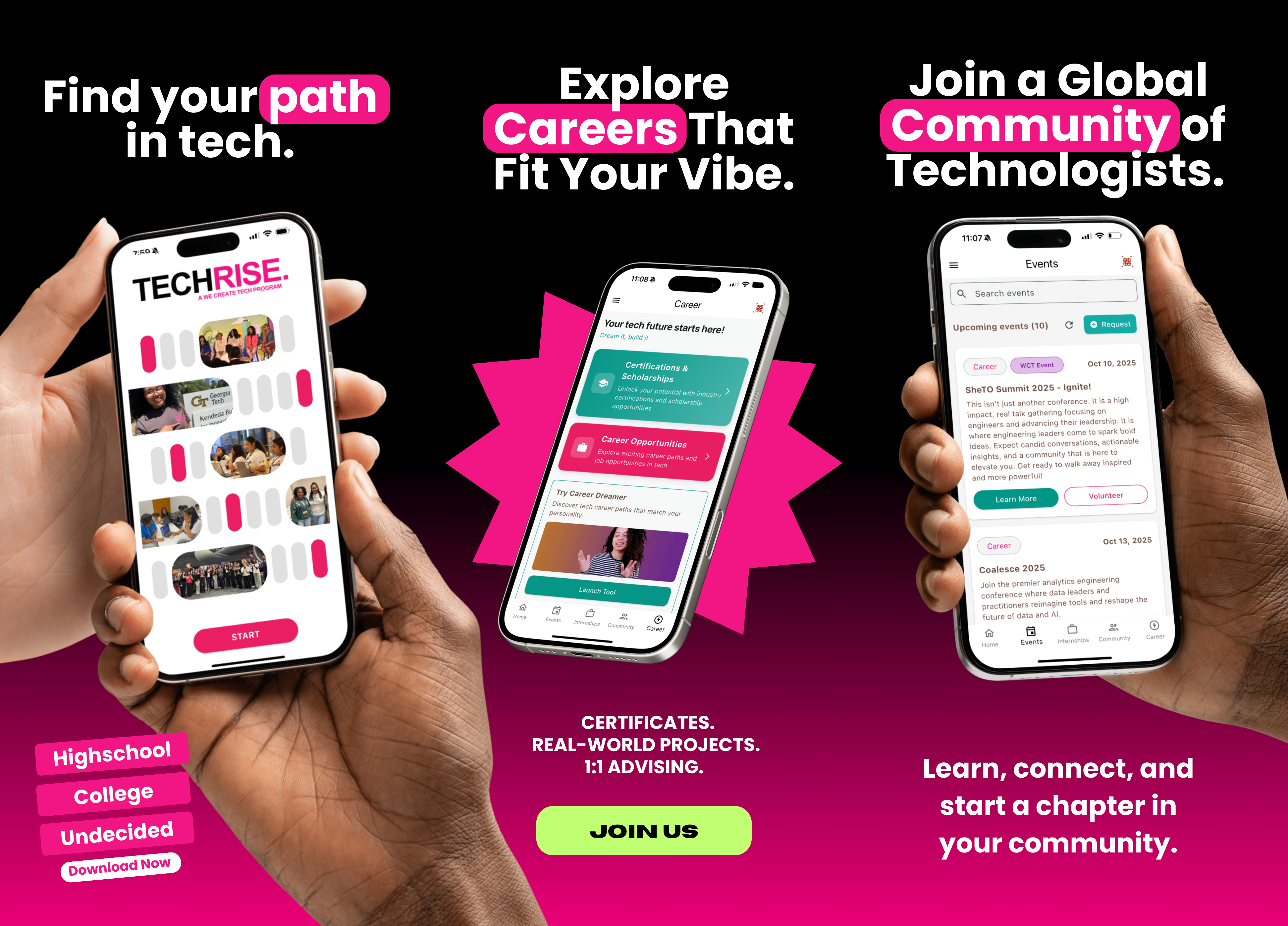
TechRise is a student-focused app designed to help learners organize tasks, track projects, and manage their academic workflow efficiently. This case study covers my redesign process, including research, wireframes, improved navigation, and final interface designs that increase usability and engagement.

Overview
Timeline: 4 Weeks
Role: UX Designer — Research, Wireframing, UI Design, Prototyping
Problem
The original TechRise app had a cluttered interface and unclear navigation. Students struggled to quickly access key tools for managing tasks and projects, which reduced overall engagement. My first step was to envision what a successful experience should feel like: quick, structured, and easy to navigate.
.png)
Research
To map the problem space, I needed a clear understanding of where students experienced friction. I combined user interviews, survey data, and competitive analysis to identify recurring patterns and prioritize what mattered most.
- User Interviews:
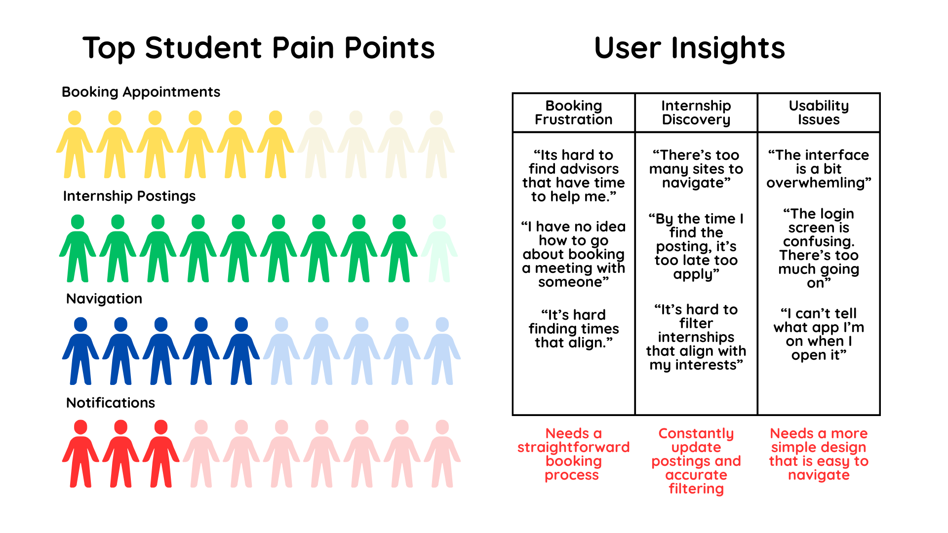
- “It’s hard to find advisors that have time to help me.”
- “By the time I find the posting, it's too late to apply.”
- “Switching between different platforms for internship postings gets frustrating.”
- Survey Responses:
- 60% of students struggle to book appointments efficiently.
- 90% want internship postings to be earier to access
- 50% find the current interface confusing.
- 30% want notifications/reminders for upcoming meetings.
- Competitive Analysis Insights:
- Existing advisor booking platforms are functional but not user-friendly.
- Internship boards (e.g., Handshake) have lots of postings but limited filtering and personalization.
- Students value simplicity and speed over extra features.

User Flows
I translated research findings into clear user flows that established how students should move through the app with minimal friction. These flows clarified which actions needed to be fastest, most visible, and most intuitive.
- Adding and categorizing tasks/projects
- Tracking progress and deadlines
- Accessing key resources and app features efficiently
Wireframes
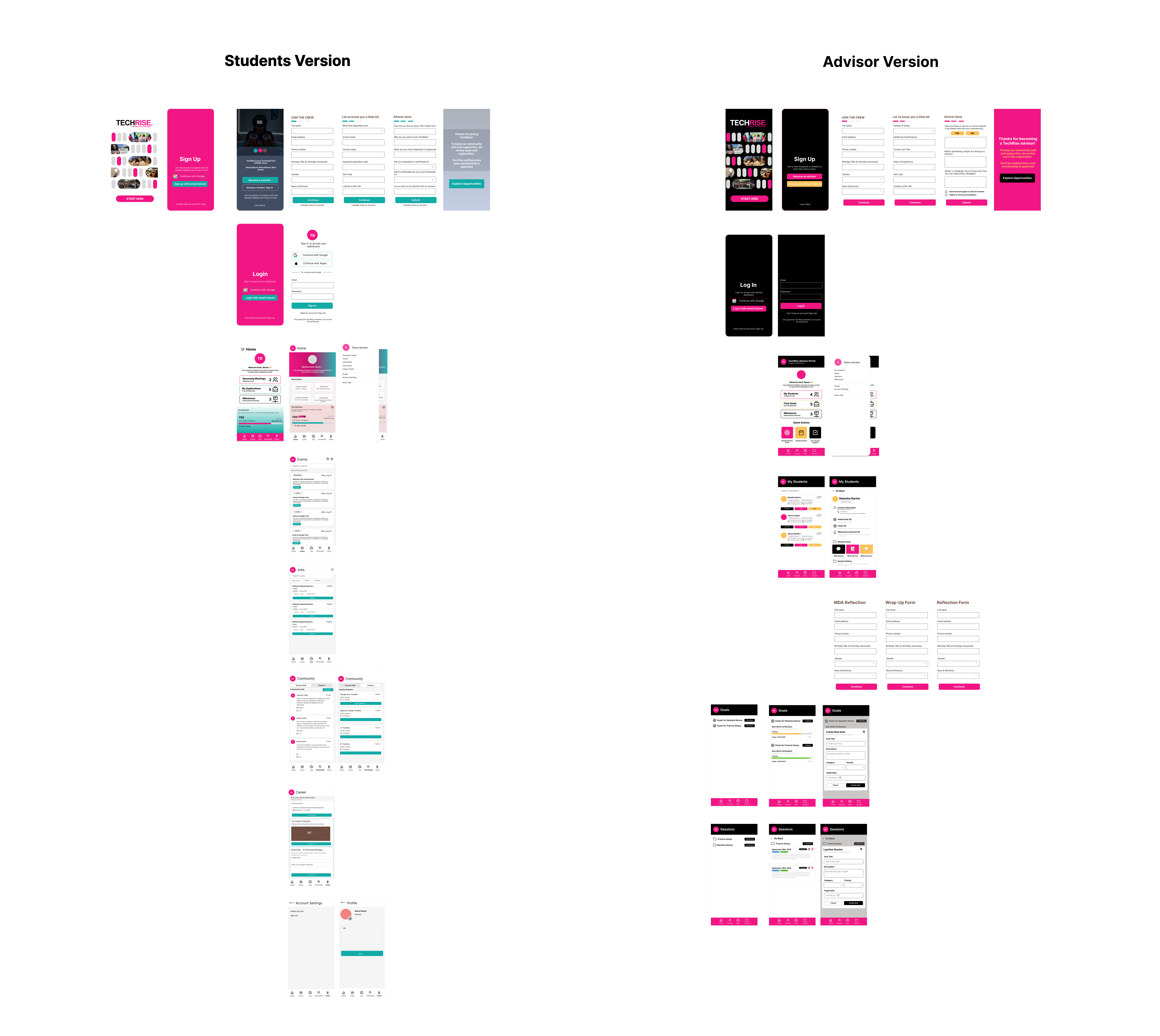
Mid-fidelity wireframes were developed to evaluate layout, visual hierarchy, and simplified navigation before progressing to the final UI design. The final design was then implemented in the TechRise app by Francis Ganya, the software engineer I collaborated with. Additionally, I designed a version of the app tailored for advisors, with potential use in a future project.

Noteable UI Changes
.png)
Reflection
This redesign improved the usability and accessibility of TechRise, helping students manage their academic workload more efficiently. I learned how to balance simplicity with functionality while maintaining a modern, engaging interface.