TechRise
redesigning a student productivity app to actually get used
01context
the app existed. the problem was adoption.
TechRise is a student-focused platform with two core jobs: help students book advisor appointments and surface relevant internship opportunities. the product had real utility on paper. but engagement was low, and the team had a hunch the interface was the reason.
i came in to diagnose whether that was true and if so, where exactly the experience was breaking down.
my role was scoped as UI/UX but the engagement required PM work from day one: diagnosing the real problem, running research, making prioritization calls, and owning scope decisions through handoff.
02problem framing
what we were actually solving for
before touching anything, i needed to separate the symptoms from the real problem. the app being "cluttered" was a description, not a problem statement.
students aren't engaging with TechRise because the cost of navigating the app exceeds the perceived value of what they'll find when they get there, especially for time-sensitive actions like booking appointments or finding internship deadlines.
this reframe mattered because it shifted the design goal. the question wasn't "how do we clean this up?" it was "how do we make the highest-value actions feel effortless and fast?"
03research
what students actually said
i ran 6 user interviews and distributed a survey to 40+ students to understand where the friction was coming from. i recruited through the TechRise user base directly. i also did a competitive teardown of advisor booking and internship tools to understand what the bar looked like.
user interviews: recurring quotes:- "it's hard to find advisors that have time to help me."
- "by the time i find the posting, it's too late to apply."
- "switching between different platforms for internship postings gets frustrating."
the interviews kept surfacing the same two pain points: advisor availability was invisible until you were already deep in the booking flow, and internship deadlines weren't visible until you opened each posting individually. those two findings shaped everything downstream.
survey data:60%
struggle to book appointments
90%
want internships easier to access
50%
find the interface confusing
30%
want meeting reminders
- existing advisor booking tools are functional but built for admin convenience, not student speed
- Handshake has volume but weak filtering; students waste time before finding relevant postings
- common theme: students value speed and clarity over feature richness. this informed a direct decision: surface advisor availability at the browse level, and move deadlines to the card level. both were zero-engineering-cost fixes via information hierarchy alone.
04synthesis & prioritization
turning findings into a focused scope
| Problem | Severity | In Scope? | Rationale |
|---|
| Confusing navigation / IA | High | ✓ Yes | Root cause of most friction |
| Advisor availability not visible | High | ✓ Yes | Directly impacts core use case |
| Internship deadline visibility | High | ✓ Yes | Zero-cost fix via info hierarchy |
| Notification system | Medium | Future | Backend dependency |
| Cross-platform aggregation | High (complex) | Future | Out of sprint feasibility |
the call to scope out notifications and integrations was deliberate. trying to solve everything in 4 weeks would have compromised the structural redesign.
05design decisions
the choices i made and why
each decision maps directly to a finding from research. nothing in here was a taste call.
i mapped the three core user flows before touching UI: booking an advisor, finding and applying to an internship, and tracking active tasks/deadlines.
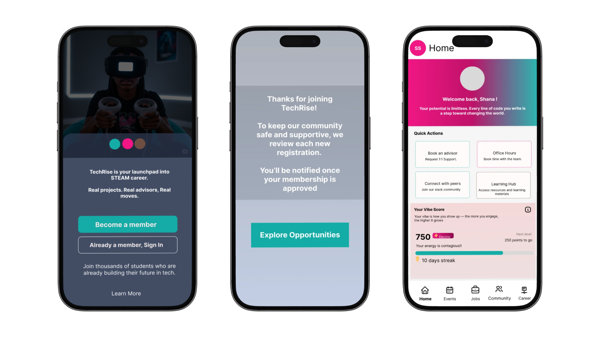
- restructured navigation hierarchy: 50% of surveyed students found the interface confusing. the root cause was too many top-level items with no clear hierarchy. reduced nav items and moved highest-frequency actions to persistent nav.
- advisor availability surfaced on browse: 60% of students struggled to book appointments. the friction was that open slots weren't visible until 4+ taps in. surfaced availability in the directory view, reducing booking to 2 taps.
- deadline prominence on internship cards: "by the time i find the posting, it's too late to apply" was the most consistent interview quote. moved deadlines from the detail page to the card-level summary so students see them before clicking in.
- task tracking simplified: students were getting stuck on complexity, not lack of features. categorization reduced to three buckets (to-do, in progress, done) based on what students actually described doing with tasks.
06tradeoffs
what i gave up to get here
- simplified task states vs. power user flexibility: students who wanted granular project tracking lost some customization. i accepted this because the majority were getting stuck on complexity.
- no onboarding flow redesign: first-run experience had friction but was a week of work alone. documented and flagged for a follow-up sprint.
- advisor UI as a variant, not a separate product: advisor-facing screens share the same component logic with the student view; kept engineering scope tight while unlocking a future use case.
07output
what shipped and what moved
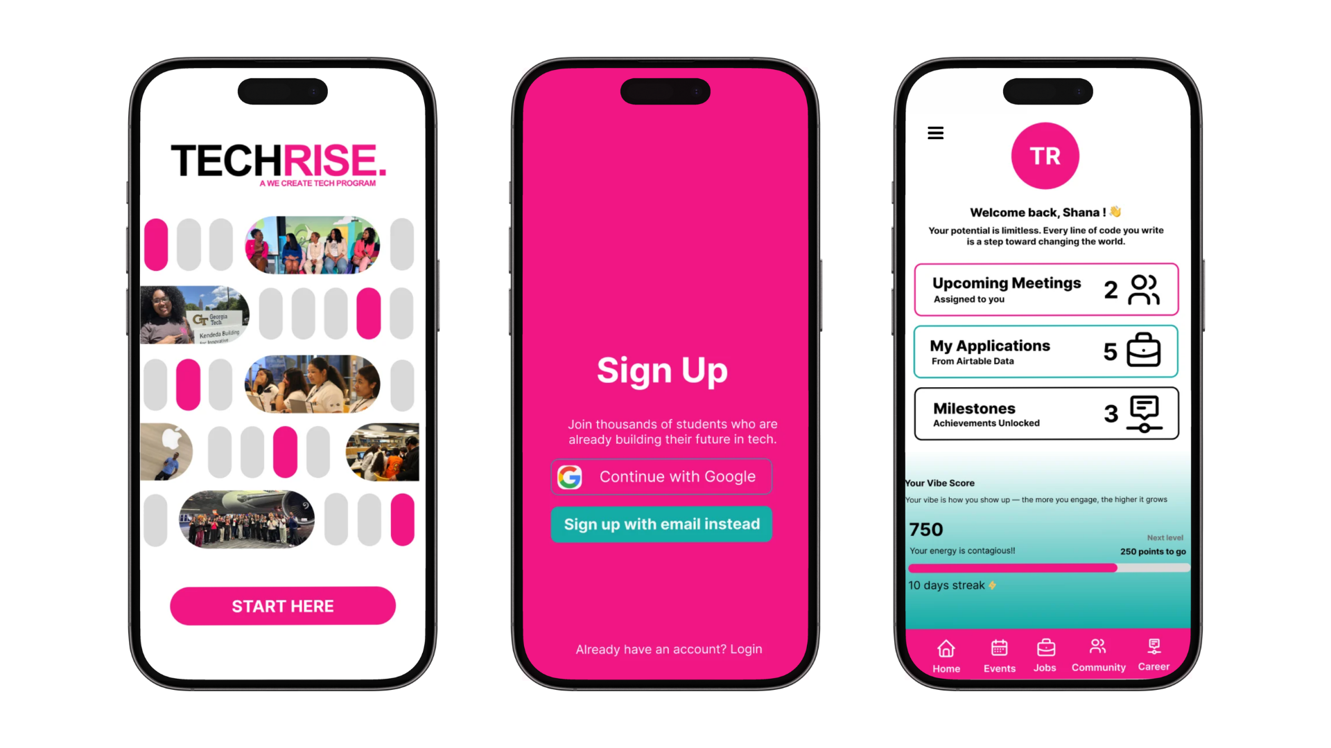
- redesigned navigation and information architecture across student-facing screens
- new advisor booking flow: reduced steps, availability visible upfront
- internship board with deadline-forward card design
- simplified task tracker with three-state categorization
- advisor-facing UI variant for future engineering use
designs were handed off to Francis Ganya and implemented in the live TechRise app. active usage grew from ~25 students to 156 following the redesign, a 6x increase in the months after handoff.
6x
increase in active usage post-redesign
25 to 156
students actively using the app
4 to 2
taps reduced in advisor booking flow
08reflection
what i'd do differently
- validate the reframe earlier: i reframed the problem as "cost of navigation exceeds perceived value" based on my read of the research, but never pressure-tested that framing with the TechRise team before designing against it. if the reframe had been wrong, i would have spent 4 weeks solving the wrong problem. next time that framing gets validated before any wireframes open.
- define the north star before touching the brief: i had no agreed success metric going in. i designed toward "feels easier" instead of something measurable like time-to-book or appointment completion rate. if i'd locked a north star with the team in week one, every scope decision would have been sharper and the outcome would have been easier to evaluate.
- document scope decisions as written artifacts: i made deliberate calls to descope notifications and cross-platform aggregation. those decisions were right, but they lived in my head. francis had no visibility into why those weren't in the handoff. a one-page scope doc would have made the engineering relationship cleaner and protected both of us if priorities shifted.
Trace
defining the brand system that makes launch possible
01context
the reminder app you can talk to
trace is a conversational reminders iOS app. users talk to it naturally, and it handles the structure. i'm the cmo, working alongside arhaan keshwani, joey zhang, and nina kilidzhiyska.
we had a working product but no visual language. no logo, no typeface, no defined way to show the app to people. that wasn't a design gap, it was a launch blocker. without a locked brand system, we couldn't run paid ads, build the app store listing, or post consistently. every downstream asset was blocked until these decisions were made.
i owned the brand system end-to-end: scoping the decision set, driving alignment, and shipping a visual language the whole team could build on, in one week, with no design budget.
| constraint | detail |
|---|
| timeline | 1 week |
| budget | $0 |
| team structure | async, gc-based feedback |
| design resources | sole designer |
02problem framing — scoping what actually needed to be decided
the real problem wasn't "we don't have a logo."
without a shared visual system, every asset we produce reads as disconnected, and we can't run ads, publish consistently, or submit to the app store.
three decisions were blocking everything downstream: logo, typeface, and product display format. until those were locked, nothing was repeatable or scalable.
i explicitly scoped out brand voice, color system, and motion guidelines. not because they didn't matter, but because none of them were on the critical path to launch. shipping those decisions in week one would have consumed the timeline without unblocking anything. the call was: solve what's blocking launch first, document everything else for a post-launch brand sprint.
that scope boundary kept the team focused and the timeline intact. it also gave us a clear definition of done: three decisions locked, all downstream assets unblocked.
03decision 01: logo — why this came first
logo came first because every other asset depended on it. typeface choices and product display layouts couldn't be finalized without knowing what mark they'd sit next to.
the filter for every option wasn't "does this look good." it was "does this give trace a mark it can grow into without explaining what the product does."
the only alignment we had going in was that we wanted the brand to feel simplistic. the first logo attempt was a glowing abstract waveform mark: white on black, soft-edged, radiating outward. it looked striking in isolation but immediately read as too complex and too heavy. it didn't feel like trace.

first logo attempt: glowing waveform mark
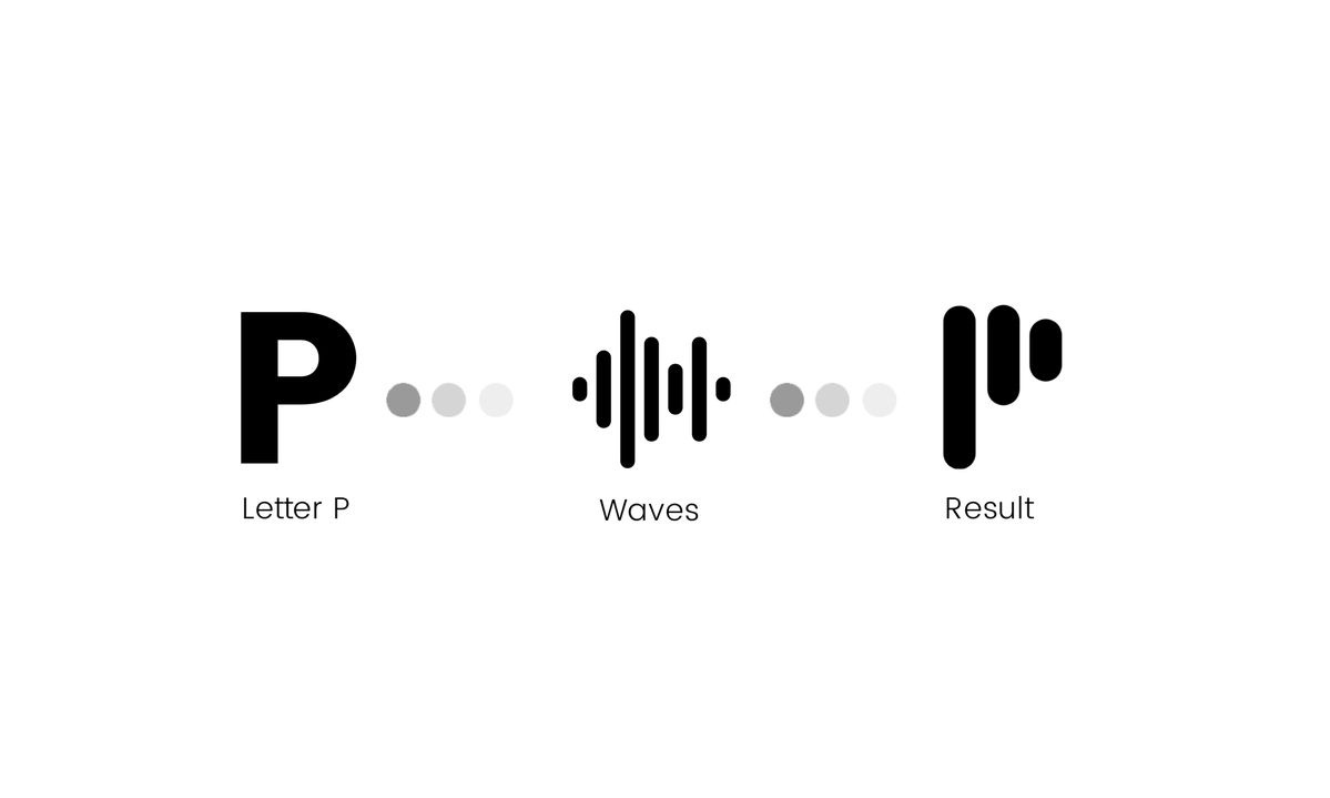
that reaction was useful data. it told us what we didn't want and gave us a clearer direction to move toward. from there, the team moved toward a geometric mark, but i pushed back: without a brand identity established yet, something that abstract gave no signal about what trace actually did. i suggested the voice memo waveform direction and put together multiple variations to pressure-test it.
we ran those variations by a small group of users. the feedback was positive on clarity — people understood the voice connection — but the more the rest of the brand system developed, the less the logo needed to do that work. the font and product displays were already communicating the product. that shifted the decision criteria: if the rest of the system carries the message, the logo just needs to be a mark worth owning.

final logo: hexagon mark
voice memo waveform iterations tested with users
| option | rationale | user feedback | verdict |
|---|
| glowing waveform mark | too ornate. contradicted the simplistic direction we had aligned on | not tested; cut before feedback round | cut |
| voice memo waveform (multiple iterations) | cleaner, referenced the app's core voice interaction directly. tested multiple variations | positive on clarity. users understood the voice connection. but felt too literal once the brand system developed | cut |
| abstract hexagon mark | geometric, clean, distinctive. not tied to any single feature, giving trace room to build its own identity around the mark over time | tested well with team once brand system was established. logo didn't need to explain the product | chosen |
final thoughts: the voice memo iterations were a necessary middle step. they clarified what the logo needed to do, and then helped us realize it didn't need to do as much as we thought. that freed us to go fully abstract. the hexagon mark is simple enough to sit small without losing its shape, and flexible enough to grow with the brand.
04decision 02: typeface — why this came second
typeface came second because it determined the wordmark, which anchored every marketing asset. without it, product display work would have to be redone after the font was locked.
the filter: find the middle ground between minimalist and personality-forward. something that sells the product to a stranger without overexplaining it.
the team's instinct was to go fully minimalist. i pushed back on that from a user acquisition standpoint: minimalism alone doesn't sell a product to someone who's never heard of it. trace needed enough personality to create a first impression. the question was how much.
we anchored off the font already on the trace website (a clean sans used for body), then focused the search on a display face that could carry the wordmark and headers.
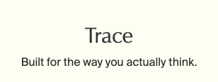
first font suggestion: building point
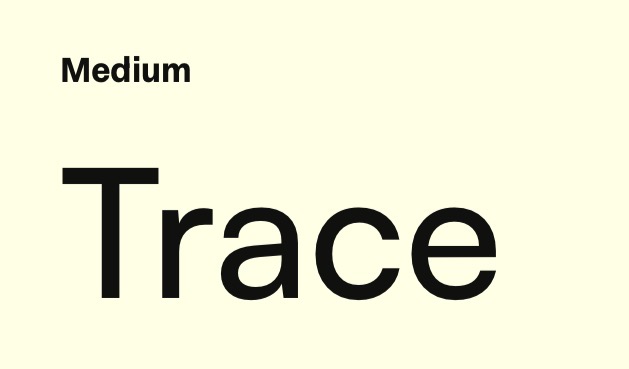 satoshi medium: not enough character
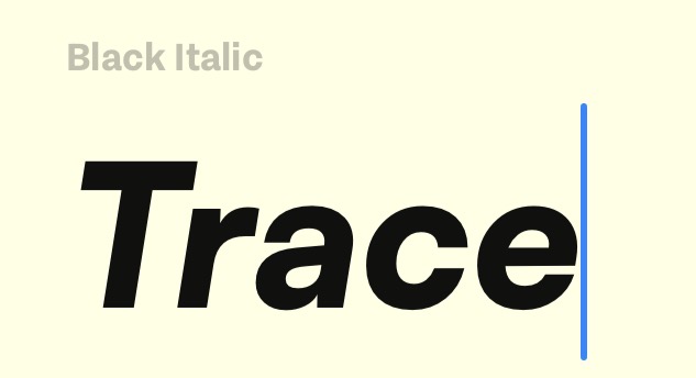 satoshi black italic: too heavy
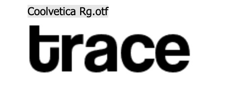 coolvetica: too elementary
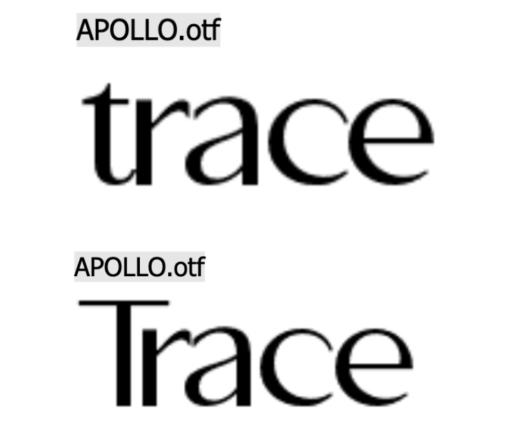 apollo otf: the middle ground
| option | notes | verdict |
|---|
| website serif (first suggestion) | too corporate. wouldn't sell the product to a consumer. flagged and cut early | cut |
| satoshi medium | clean geometric sans. not enough character for what trace needed at the wordmark level | cut |
| satoshi black italic | too heavy. didn't match the simplistic direction | cut |
| coolvetica rg | rounded and informal but read too elementary for the brand we were building | cut |
| apollo otf | editorial serif with real character. hit the middle ground between minimalist and playful. team aligned immediately | chosen |
with apollo locked, we tested uppercase vs lowercase for the wordmark. uppercase read too formal and corporate. lowercase felt intentional and matched the conversational nature of the product. we locked in all lowercase.
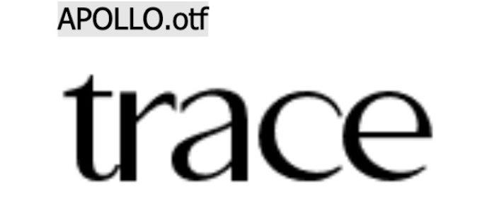
final font: apollo otf, lowercase
05decision 03: product display — why this came last
product display came last because it depended on both the logo and typeface being final. building it earlier would have meant rebuilding it twice.
the filter: does this format work as a repeatable template across social posts, paid ads, and the app store listing? if we couldn't reuse the same layout across all three surfaces, it wasn't the right format.
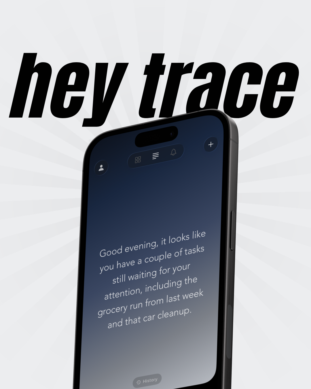
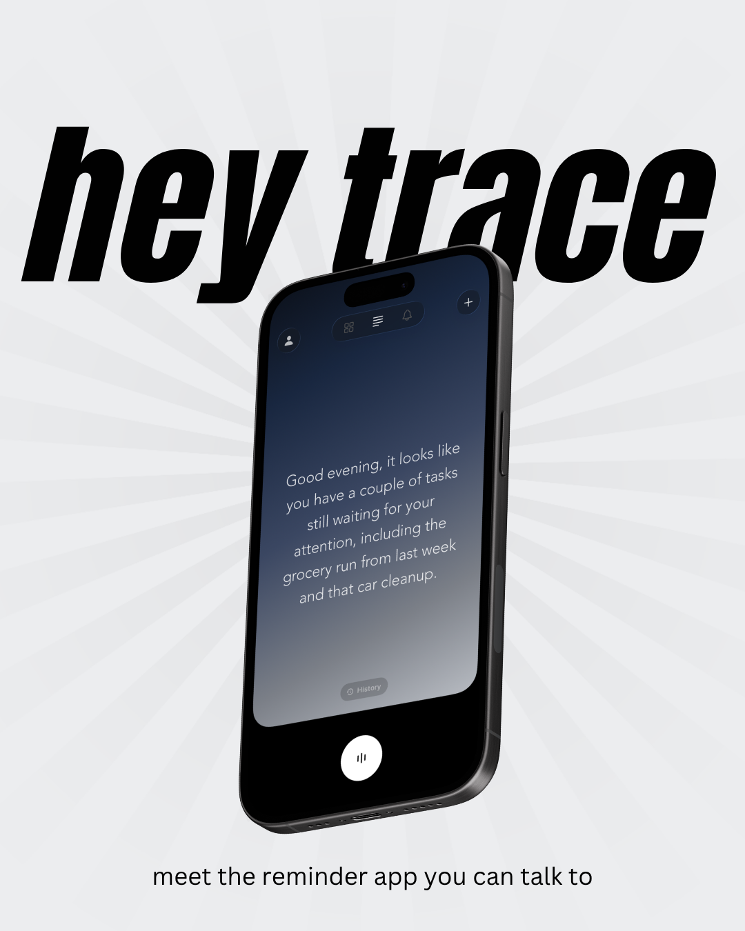
phase 1: pre-rebrandthe first attempts used a "hey trace" headline format with a single angled phone mockup on a light starburst background. the copy and layout were attention-grabbing but the visual didn't feel like the product. without the brand system finalized, nothing was anchoring it to trace specifically. i flagged this early: these assets couldn't go live until the brand was locked, or we'd be remaking them anyway.
phase 2: post-rebrand iterationsonce the font and logo were locked, i rebuilt the product display around the finalized brand. the format shifted to a dark background with three angled phone mockups showing the app in context. this immediately felt more like trace. the team responded positively but it still took a few passes to get the hierarchy right.
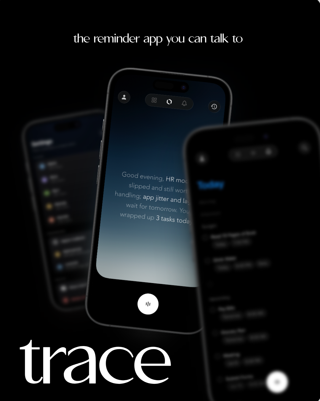 iteration 1
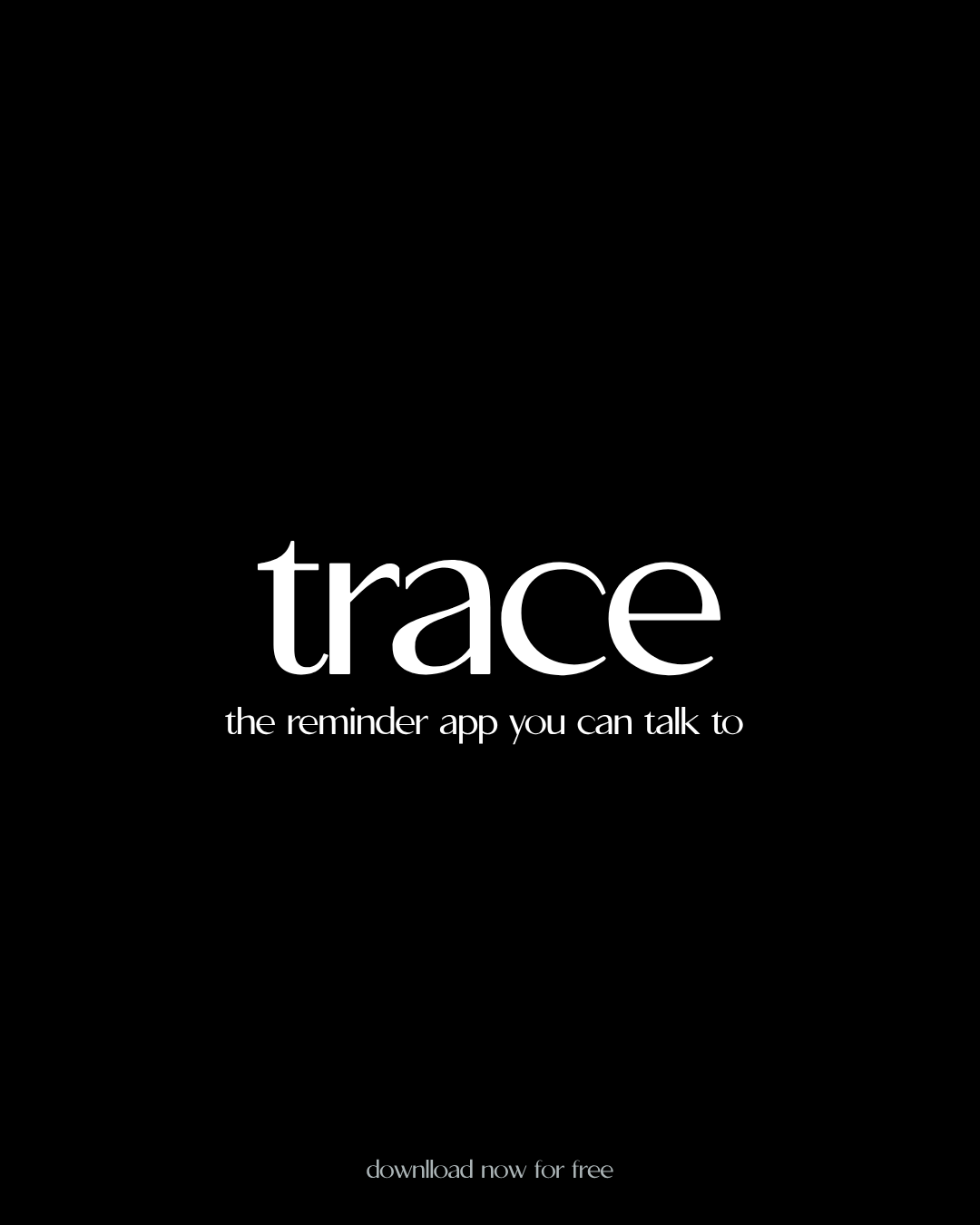 iteration 2
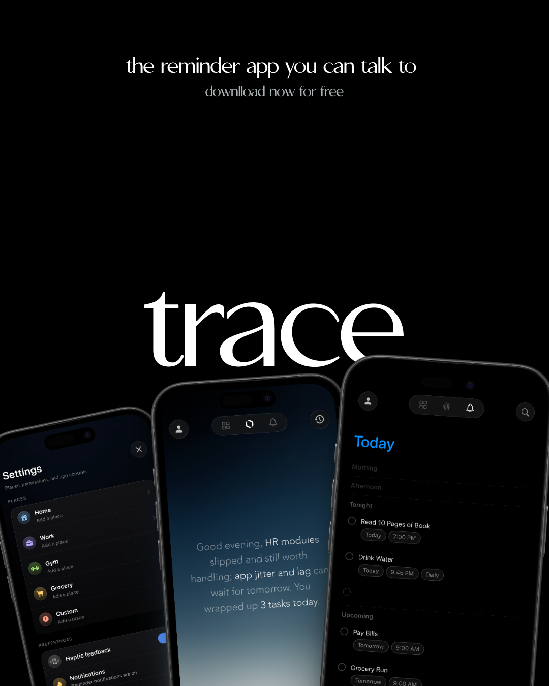 iteration 3
after the initial iterations, two clear pieces of feedback came back: visual hierarchy needed work and the logo was missing. the wordmark was either too large and competing with the phones, or absent altogether, leaving the display unanchored from the brand. i took that feedback, brought the sizing down, repositioned the elements, and reintroduced the logo in a way that complemented the product shots rather than competing with them.
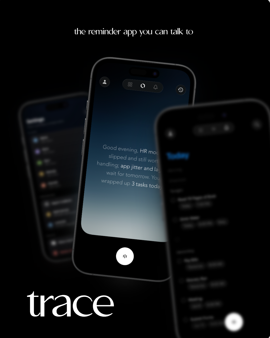 font size + placement adjusted
.png) logo incorporated
logo incorporated.png) logo incorporated
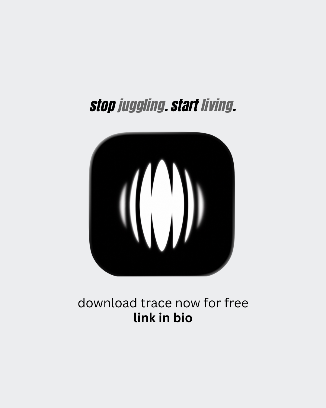
logo incorporatedafter evaluating the iterations against the filter (repeatable across social, ads, and app store), two formats came out on top. both balance the product, the wordmark, and the logo without any one element overpowering the others.
top choice 1 top choice 2
06outcome
what shipped and what it unblocked
by end of week we had a working brand system: hexagon icon mark, apollo otf wordmark in lowercase, and a repeatable product display format.
more importantly, we unblocked everything that had been blocked:
- paid ad assets: first creative ready to run within 48 hours of brand lock
- app store listing: visual assets complete and submitted
- social posting: consistent template in use across all posts from launch week onward
- team alignment: brand decisions documented, no re-litigating on every new asset
the geometric precision of the hexagon paired with the editorial character of apollo reads as minimal but intentional. together they establish what trace looks and feels like before a single feature gets explained, which is exactly what a pre-launch brand needs to do.
3
launch blockers resolved
48hr
to first paid ad asset after brand lock
0
brand decisions re-litigated post-lock
1
wordmark locked (apollo otf)
1
icon mark locked (hexagon)
1
product display format locked
07reflections
what i'd do differently
- scoping is a product decision: explicitly cutting color system and motion guidelines from this sprint kept us on track. knowing what not to solve is as important as knowing what to solve. i'd document that scope boundary as a written artifact next time, not just a verbal call.
- decisions need a filter, not a vote: every option moved faster once i framed it around what trace needs to communicate to a stranger. aesthetic preference is noise; user perception is signal.
- structure the user feedback: we got useful signal from testing logo options, but "tested well" isn't a methodology. next time i'd define who we're testing with, what we're measuring, and what feedback would actually change the decision before running the test.
- pushing back is part of the role: i disagreed on two directions the team initially favored. both pushbacks led to better outcomes. holding the brand standard even when something "looks fine" is part of the cmo job.
- async feedback is fast but incomplete: gc consensus isn't a substitute for structured user feedback. for a v2 brand refresh i'd want actual target users reacting to options, not just team alignment.
progsu
from dormant club to gsu's largest cs community
01the short version
what actually happened, and what made it matter
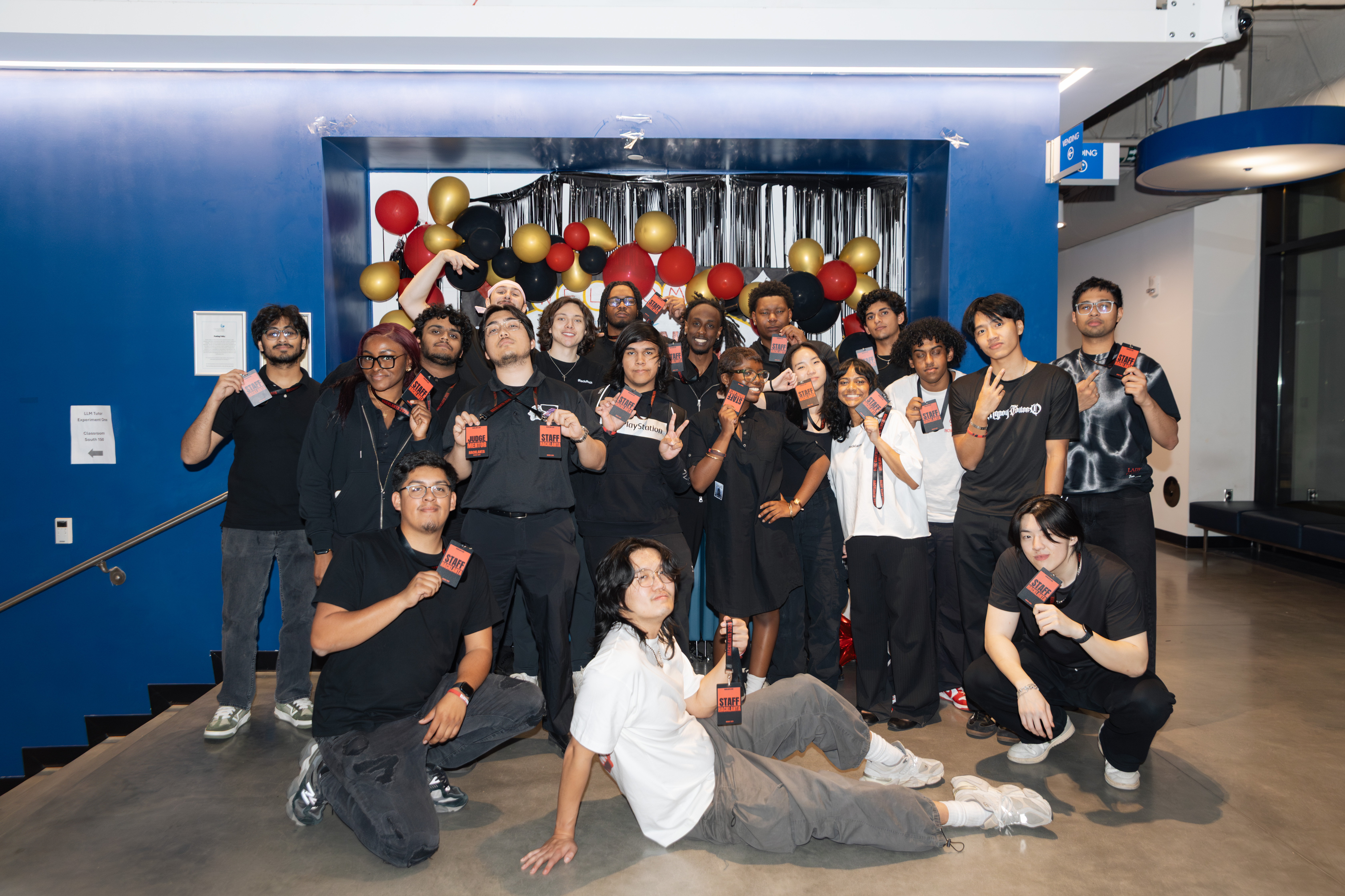
progsu went from a 10-person board with no working operating system to a 1,500+ member organization across four georgia campuses, anchored by hacklanta, gsu's first hackathon since 2017. the two decisions that mattered most: betting on one flagship event over continuing to grow through smaller ones, and the structural rebuild that let the org actually carry the volume that bet brought in. everything else below is what made those two calls possible, or what they cost.
02the problem
a club with history but no operating system
progsu wasn't a new club. it had five years of real history behind it: founded in 2020, registered student org status by 2021, safc funding and full university partnership by 2023, a discord community that had grown past 1,100 members at its peak, six presidents across five years. on paper, it had legitimacy.
by the time joey relaunched it in summer 2025, the board was down to about 10 active people.
the assets were still there. roughly 30 google docs laid out structure, role titles, and where the club wanted to go eventually. the direction existed, technically. what didn't exist was a way to turn that direction into weekly output. joey put it plainly: the club had people who could execute and people who were creatively skilled, but no one setting the vision or allocating the work. it wasn't a talent problem or an awareness problem. it was a leadership operating system problem.
that distinction mattered for everything that came after. if the gap had been "we need more members" or "we need better flyers," the fix would have been tactical. it wasn't. the fix had to start with direction-setting and task ownership before a single event got planned.
03decision 1 — fix direction, then build a system that could execute it
mission before momentum
the first move wasn't a flyer or a post. we needed a mission and vision statement before anything else got built. if you'd asked anyone on the board to pitch progsu to a stranger in one sentence, they couldn't do it, and without that, every other call — what to post, what events to run, who to bring in as sponsors — had no filter to run through.
the trade-off was real: every day spent on a mission statement was a day the board wasn't posting content or running events, exactly the momentum a freshly relaunched club needed. i made the call anyway, because momentum without direction would have just been busywork that didn't compound. joey drafted the actual statements; i pushed for them to exist first. the version that stuck: reignite the builder spirit at a commuter school with no flagship cs program, by winning on community and accessibility instead of prestige, since most existing tech-club playbooks were built for schools that had neither problem.
direction doesn't execute itself, though. the next problem was getting a small board to actually finish tasks on a deadline, and that took three tries:
| attempt | what happened | outcome |
|---|
| notion | board had no prior familiarity with it | barely opened, work didn't move |
| trello + dedicated discord channel | pinged repeatedly, plus 1:1 follow-ups | still ignored; the 1:1s started to feel like surveillance to members |
| live google doc during weekly meeting + discord ping for follow-up | tasks assigned in real time, owner pinged directly post-meeting, expected to flag blockers themselves | output increased; some members still needed active guidance, but tasks started closing |
the bottleneck was never the tool, it was adoption behavior. the system that worked was the one that matched how the team already communicated, not the one that looked most professional on paper.
04decision 2 — killing a flawed plan in real time instead of defending it
the rps tournament and the live pivot
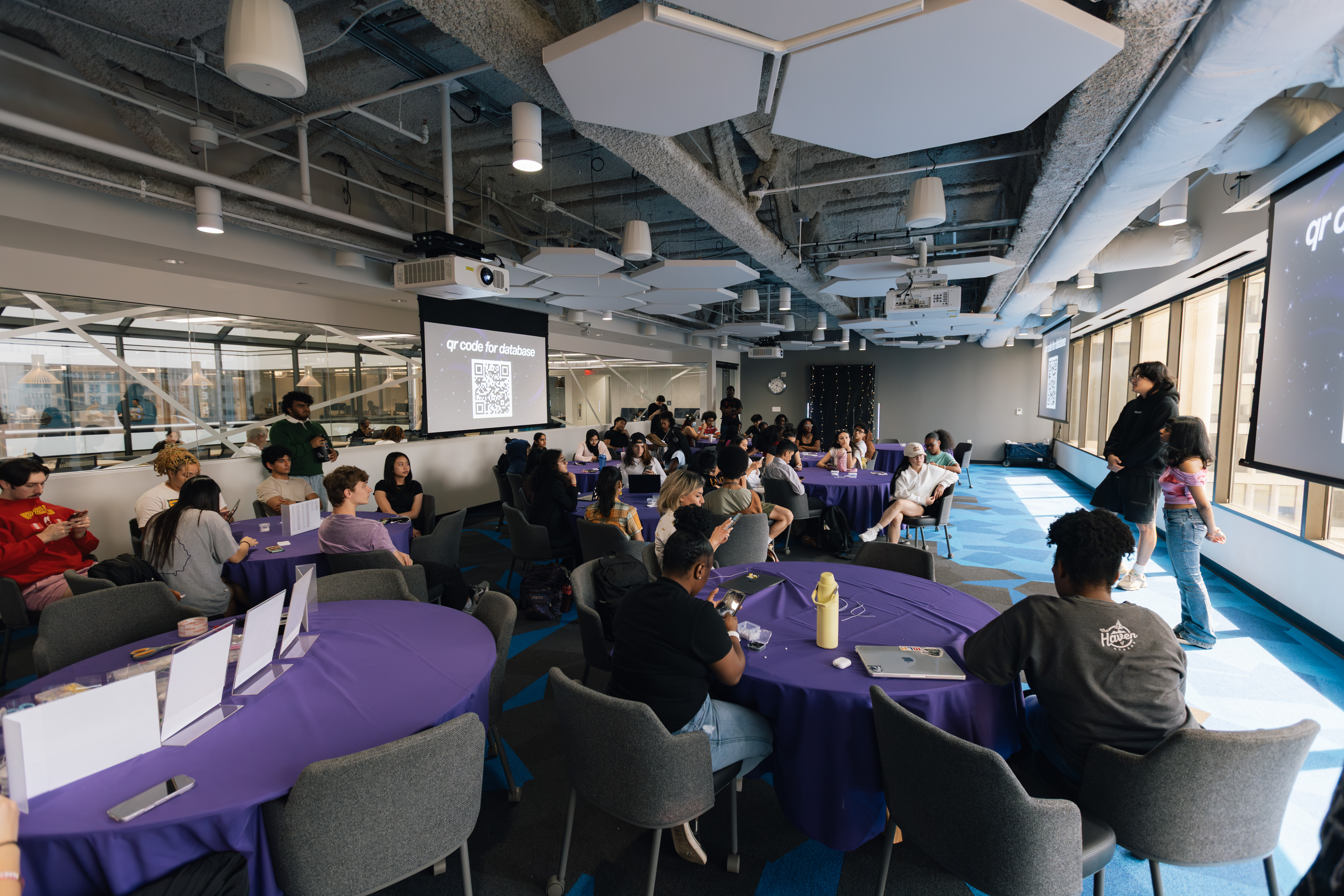
the first real test of the relaunch was the fall kickoff, paired with a rock paper scissors tournament built for an expected 200 attendees.
going in, the proposed format was overcomplicated: three wristbands per person, a "gulag" bracket for eliminated players, multiple rounds, and four dedicated spectator roles. i flagged before the event that this would be too much for a room of tired, shy cs students to follow from a single explanation, but the team kept the original plan.
it broke down live, exactly as expected. the easy move would've been to let it limp through and fix it for next time. instead, mid-event, i made the call to scrap the format on the spot: 1v1 matches, winner takes the loser's wristband, most wristbands at the end wins. had the president announce the change immediately, no waiting for consensus first. from there it ran itself: people started finding their own opponents, the "spectators" pivoted to helping people pair up, and the room had one of its best nights yet.
two things changed permanently after that event: we built a tighter run-of-show before future events instead of relying on live fixes, and we made it a standing rule to always capture one strong, full-room photo, because a packed room with no proof of it doesn't do much for a club trying to convince people the relaunch was real.
05decision 3 — redesigning the org, then redesigning it again as we scaled
structure as a product
after the kickoff, the team had grown but responsibility hadn't kept pace: marketing was 5 people, tech was 4, outreach was 3, with no clear lines between them. i led the rebuild on the marketing and outreach side; the overall structure was a joint call with joey and the board.
initial structure, post-kickoff| level | role | scope |
|---|
| top | president | sets vision, fills gaps everywhere |
| domain vp | vp marketing | owns content, growth, brand end to end |
| domain vp | vp tech & workshops | owns workshops & hack nights end to end |
| domain vp | vp startups | owns build nights & venture track end to end |
| domain vp | vp outreach | owns partnerships & sponsors end to end |
| shared ops | secretary / pm | docs, sops, handoffs |
| shared ops | finance | budget, reimbursements |
| shared ops | event coordinator | logistics, day-of execution |
that held up at a couple dozen people. it didn't survive hacklanta. once the org hit 1,500+ members across four campuses, four flat domain vps couldn't carry the volume anymore, so we rebuilt a second time into a full c-suite.
scaled structure, post-hacklanta| domain | lead | vps | directors |
|---|
| tech & development | cto | vp of t&d, vp of programming | software dev, hacklanta, education |
| operations | coo | vp finance, vp of ops | finance, logistics, events |
| growth | cmo | project manager, vp of branding | content, podcast, design, analytics, community |
| relations & outreach | cro | still being staffed | still being staffed |
the cadence scaled with it: one weekly sprint with the co-founders and the four c-suite leads keeps the org aligned at the top, then each function runs its own weekly sprint inside its own team.
06decision 4 — betting on the flagship event
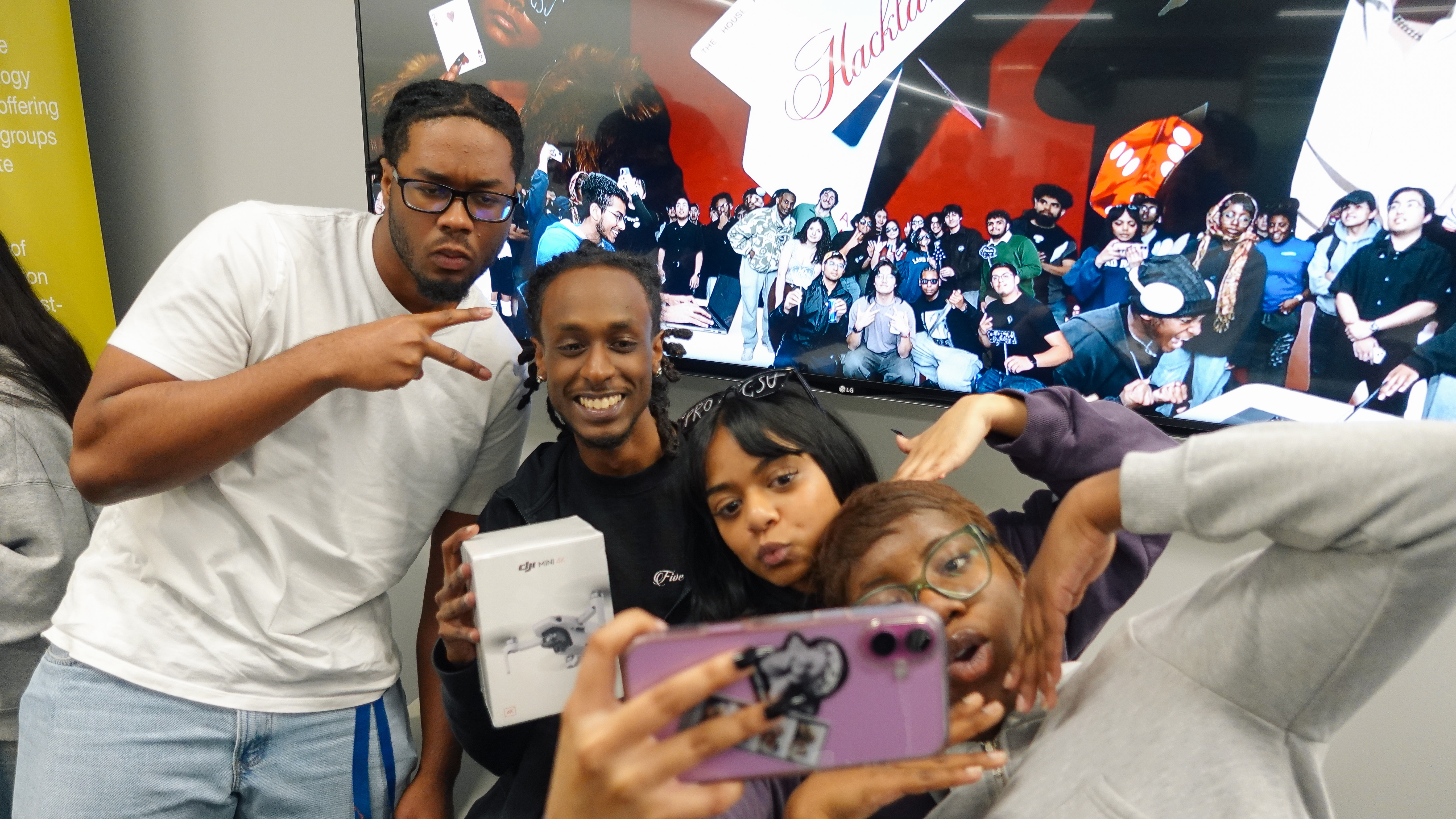
hacklanta: gsu's first hackathon since 2017
by this point the club had momentum: regular workshops, a clear identity, growing membership, nonprofit status in motion. the next call was the highest-stakes one: keep compounding through small recurring events, or make a single, much bigger bet.
this one was a group call. the case we made together as a board: gsu hadn't run a real hackathon since 2017, and even that one underperformed against regional players like hackatl and hackgt. the only options on campus were small and exclusive. there was a clear, unclaimed gap — a flagship event that could pull in students beyond gsu and put the club inside the broader atlanta tech ecosystem instead of just the campus bubble.
build nights and workshops didn't stop for the sprint — if anything they mattered more: that existing programming doubled as hackathon prep, and the sponsor companies already showing up to build nights gave students an early shot at getting on a recruiter's radar before hacklanta weekend even started. five weeks, from scratch, to gsu's first in-person hackathon in nearly a decade.
five weeks also forced a real choice on where to spend the team's time. paid social wasn't a real option, so the actual trade-off was flyers against a built channel: we built a direct channel into cs classrooms instead — a professor database, a single outreach message the whole team sent and followed up on, and volunteers delivering a short prepared pitch in person, classroom by classroom. we don't have clean attribution data tying signups directly to those visits, but it was the only promotion channel running at real volume in those five weeks, and the hackathon still pulled 400+ hackers with zero track record behind it.
—what didn't work: build nights
an honest account of what quietly collapsed
build nights started strong: real attendance, real energy, a clear weekly home for anyone who wanted to actually build something. by the back half of the semester, turnout had quietly collapsed.
promotion for build nights never got the same discipline applied to hacklanta or the kickoff — no dedicated outreach push, no repeatable format, just a recurring event riding on whatever attention the brand had left over from bigger pushes. unlike the rps tournament or the ping pong table, there was no single live moment that forced a fix. it just slowly lost relevance.
looking at it now, the root cause is visible in the org chart itself: in the post-kickoff structure, vp startups owned build nights end to end. in the c-suite rebuild, that domain disappeared, and build nights never got reassigned anywhere. a program that loses its named owner during a restructure doesn't get killed on purpose — it just stops being anyone's job.
the fix starts there: give it an explicit owner in the current structure, point the classroom outreach channel that worked for hacklanta at it directly, and track week-over-week attendance as a leading indicator so a decline gets caught in two weeks instead of discovered at the end of a semester. it's still an open problem heading into next semester.
08results
what the numbers looked like
org growth1,500+
total members across gsu, georgia tech, ksu, and uga
10 → c-suite
active board at relaunch → scaled exec structure
400+
hackers, built in 5 weeks from zero
23 → 18
sponsor interviews → hires
1,700+
opted-in talent profiles
~30
students placed into first internships
400k+
views across social platforms
09in motion
what's being built next
| initiative | status |
|---|
| progsu talent platform | building a year-round system that ranks and filters student profiles by resume, skills, and verified event performance — giving sponsors a persistent funnel instead of a one-weekend snapshot |
| hacklanta ii | planned for october 2026, with a 6-month runway this time instead of 5 weeks, targeting 1,000+ hackers |
| progirls | a women-in-tech initiative built on investment over inclusion — running panelists, company visits, workshops, and wellness programming, launched post-hacklanta |
10reflection
what this taught me- fix the system carrying the weight, not the symptom sitting on top of it. a recurring problem is rarely isolated — it's usually evidence the structure underneath can't carry what's being asked of it anymore.
- adoption beats design. the best system is the one that already matches how people behave, not the one with the best reputation or the most features.
- a single win doesn't validate anything — repeatability does. one good outcome can be luck. the same result holding up under harder constraints the second time is evidence.
what i'll keep in mind going forward- build a contingency plan before the live moment, not during it. flagging a risk early isn't a substitute for having a plan ready for when it actually shows up.
- design measurement into a new channel or system before scaling it, not after, so what's actually working can be proven instead of guessed at backward from results.
- treat any org structure as provisional. the right design at one scale is usually the wrong one at the next, so ownership and layers should get revisited on purpose, before growth forces the rebuild.
 Loading Natasha's Portfolio...

 CD Player

 Self Portrait - Paint
 About Me - Notepad
 Experience
 Case Studies
 Photos












 Switch to Web Version